
From Italy to the world, with the same (delicious) flavor
When a historic brand like Galbusera decides to take its products abroad, it’s because it knows that goodness knows no borders. The unmistakable flavor of its creations is a guaranteed success, even on the other side of the world. From a distribution standpoint, however, exporting typically Italian products overseas is also a graphic challenge. It’s a complex process that requires cultural sensitivity, technical precision, and that ability to adapt which turns packaging into a bridge between countries thousands of kilometers apart.
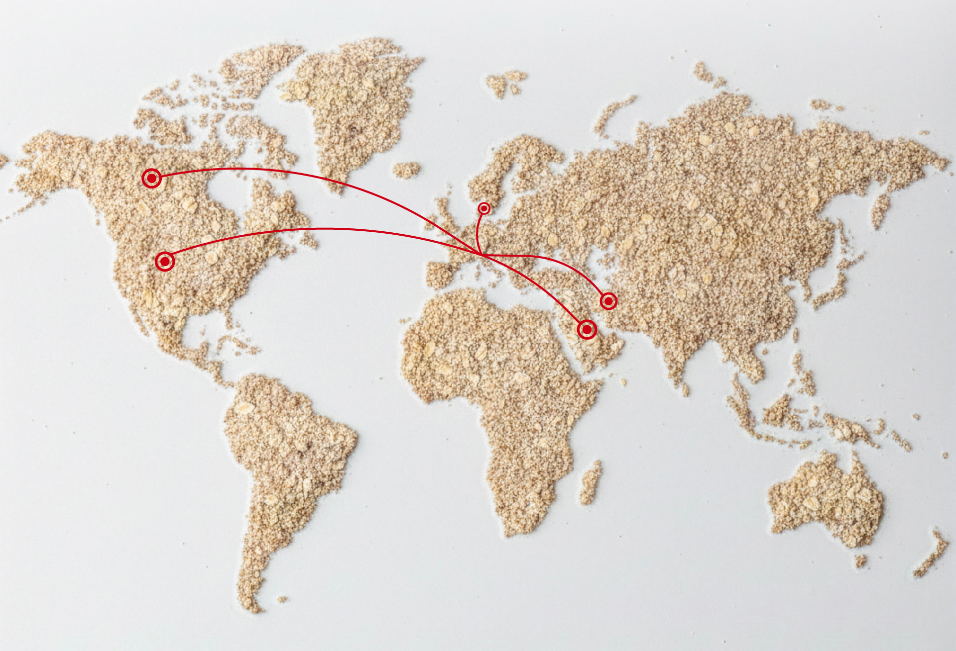
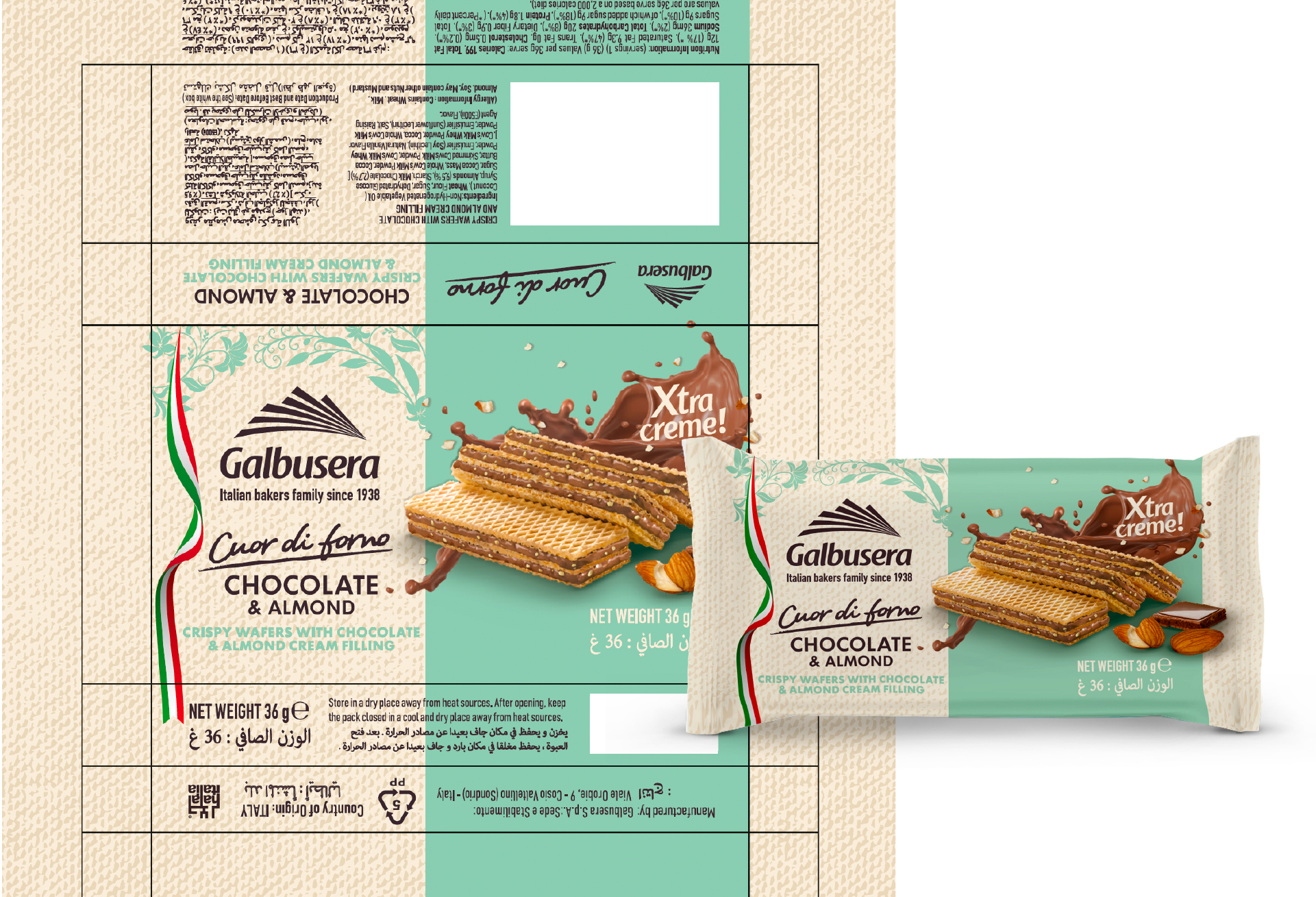
For years, we have been working alongside Galbusera on the adaptation and localization of the Tre Marie line packaging for international markets: Europe, North America, and the Middle East. Wafers, shortbread cookies, soft biscuits: each pack is redesigned to speak—quite literally—the language of the local consumer.
Different alphabets, the same identity
The complexity of this work goes far beyond simply replacing text. Moving from the Latin alphabet to Arabic or Hebrew means rethinking alignments, proportions, and visual hierarchy. Arabic is read from right to left; Hebrew requires specific typographic considerations.
It is precisely the Middle Eastern market that represents the most stimulating challenge, with its variety of alphabets and graphic conventions. Each market also has its own distribution policies and regulatory requirements to comply with: nutritional information, certifications, and mandatory statements.
The perfect balance between a global brand and local culture
Our role is to ensure that, on every shelf around the world, Galbusera products retain their recognizability and appeal, while fully complying with local regulations.
Working with such a beloved brand means entering Italian households—and not only: it also means being present in the homes of European, American, Canadian, and Middle Eastern families.
Propaganda3 around the world
Galbusera is not the only project that takes us beyond Italy’s borders. Among our international projects is the creation of the visual identity for “Curiosity” for the Italian General Consulate in Hong Kong, on the occasion of Business of Design Week 2025: a graphic system that shaped the event’s communication, highlighting Italian creativity on a global scale.
Discover the “Curiosity” case study here. Enjoy!