
Stories of labels, wines, and other tales
A sheet of paper can become a story. A piece of adhesive material can convey the soul of what it wraps. With Stamparte, together with IBE – Labels and Sleeves, we’ve taken the art of label printing to a new level, entirely dedicated to the world of wines and spirits.
Sketching on a blank page? Right away!
It all began with the design of a creative brochure for the wine & spirits sector, which IBE would then use as a presentation for its clients. A wholly original, creatively free project sparked by a phrase—“you have carte blanche”—that every designer dreams of hearing more often.
This pact of trust immediately created a unique synergy between IBE’s technical expertise in printing processes and our graphic vision, pushing beyond the limits imposed by traditional labels.
The play of contrasts in “VISION of MONd”
Inspired by Piet Mondrian’s art, this concept plays with the deconstruction and recomposition of elements. A tactile dialogue that leverages contrasts to find a new harmony: the opposition between Sabrage, highly textural, and Raflamatt, a matte coated stock—both from UPM Raflatac—is a bold move that piques curiosity and stimulates the senses.
Techniques such as complex die-cutting, micro-embossing, and hot foil stamping give rise to a label that reveals its own complexity through the interplay of void and solid, light and dark, round and squared.
Screen printing and liquid foils: the blossoming of “LOTUS LIQUID”
The “favorite child,” LOTUS LIQUID, is born from the apparent contradiction between technical simplicity and sensory richness. Without digital printing—but with screen printing, embossing, liquid foil, and depastillage—this label layers two opposite materials: a metallized base and an upper layer featuring Tintoretto Cristal Salt from Fedrigoni.
Like a lotus flower emerging from water, the LOTUS LIQUID design creates a visual illusion where it’s impossible to tell where the wine ends and the foil begins, offering a perceptual experience that is non-linear and deeply personal.
The permanent deboss of “AURORA DORATA”
The project’s most technically advanced challenge uses Paper Watermark by Avery Dennison, with a hot-stamping technique that achieves a permanent deboss effect without foil, making each label a unique, unrepeatable piece.
Like the aurora borealis, never the same twice, every bottle features a panel that varies on each label printed in the roll, preserving only a subtle fil rouge in the central foil area.
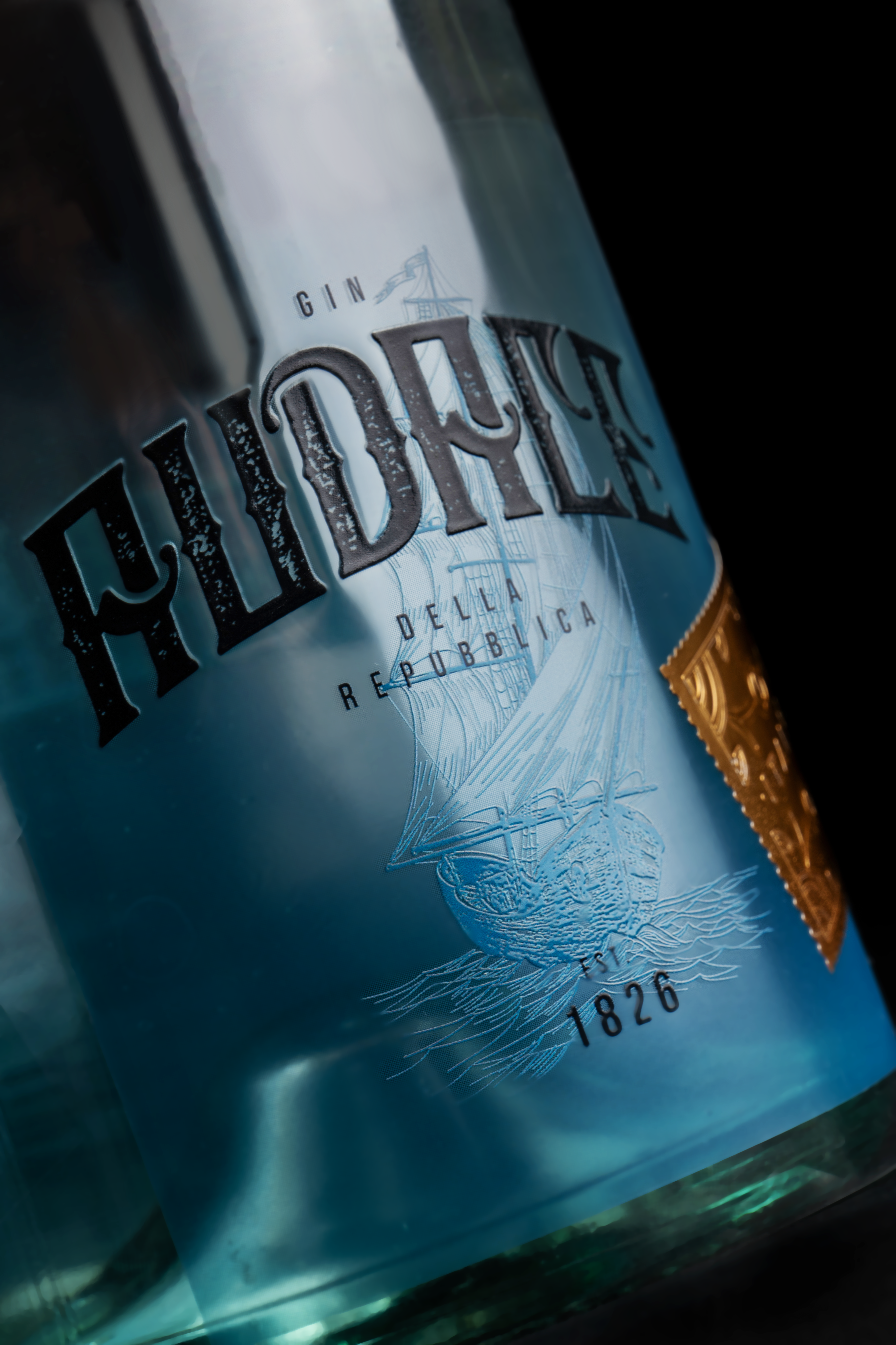
Hybrid printing and stone varnish: the character of “GIN AUDACE”
If Lotus Liquid was the firstborn, GIN AUDACE is certainly the beloved second child—because for both us and IBE, it was love at first sight. The hybrid printing technique—a combination of flexo printing for the matte background and digital printing for ultra-crisp details—is enriched with stone varnish, creating a contrast between tactile roughness and metallic finishes.
Precise die-cutting allowed this “postage stamp” to be applied to the main label, pushing technical boundaries to achieve a flawless process complete with embossing and debossing.
A wine & spirits brochure “on another level”
The wine & spirits brochure showcasing these creations depicts the various production layers in isometric perspective: processes, papers, and foils overlap to convey the complexity behind crafting a label. The bottle silhouettes complete the narrative, making the labels feel vivid and tangible.
The power of collaboration
“Collaboration with specialized partners makes extraordinary objects possible,” notes our Filippo, the lead designer on the project. And Roberto Gilli from IBE Labels and Sleeves agrees: “This was an important synergy, a union of visions that allowed us to complete this project to everyone’s great satisfaction.”
Want to explore more cases where graphic elements become the protagonists of wine? Dive into the next project.