
The starting point
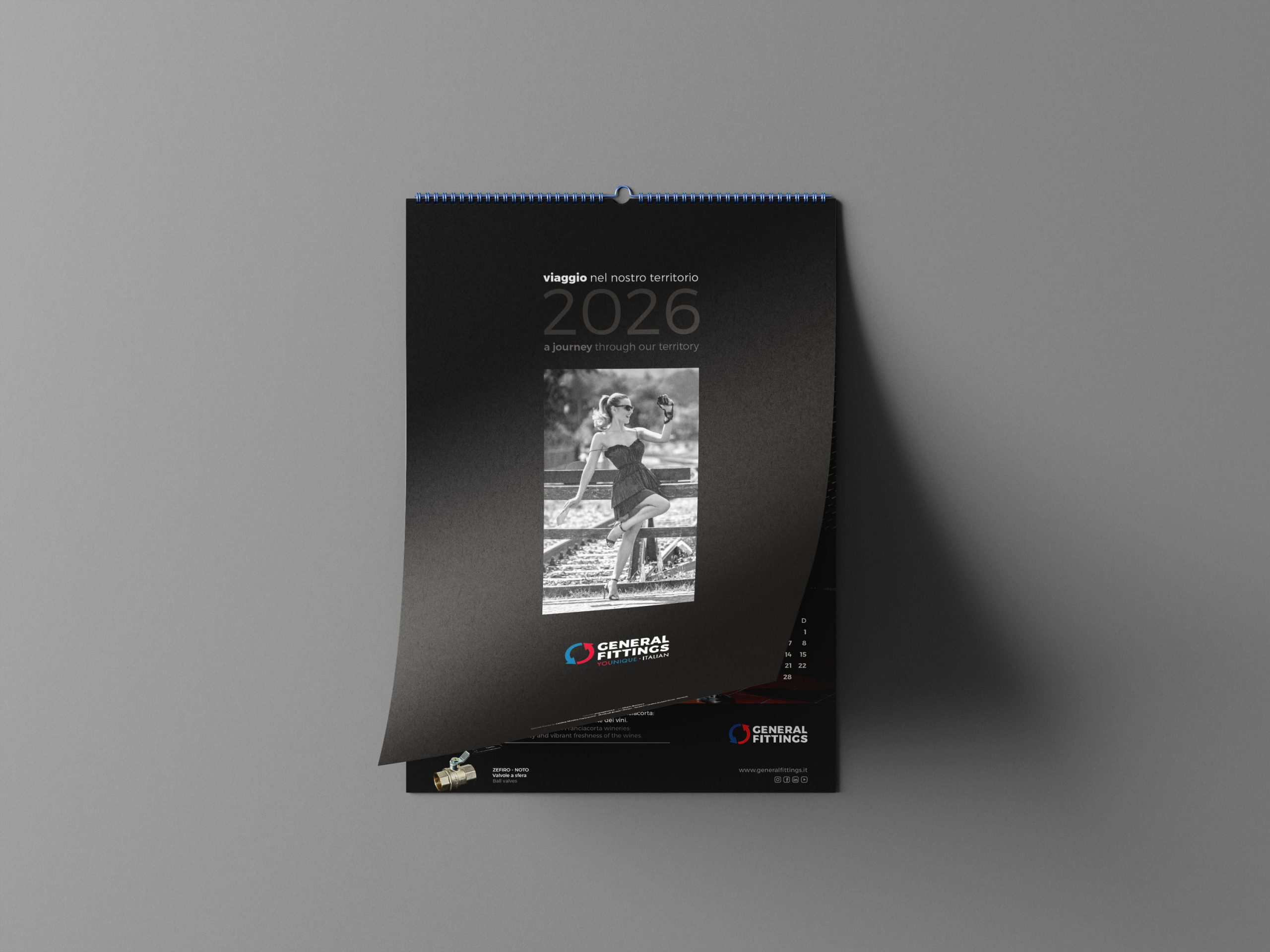
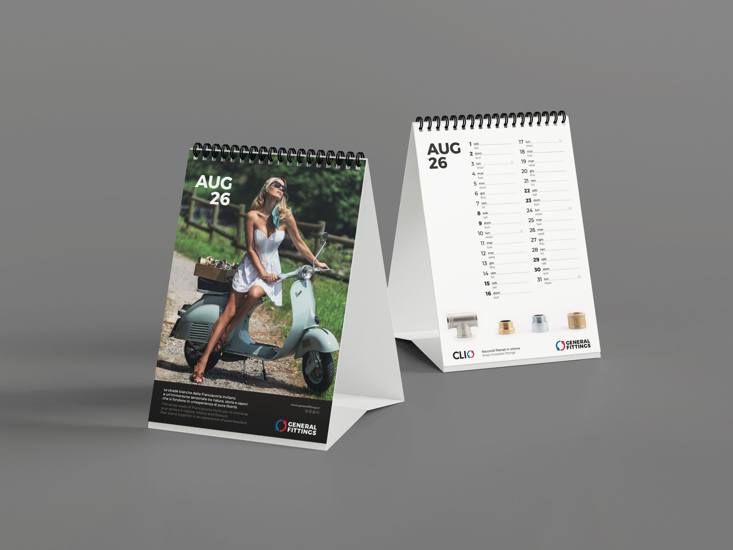
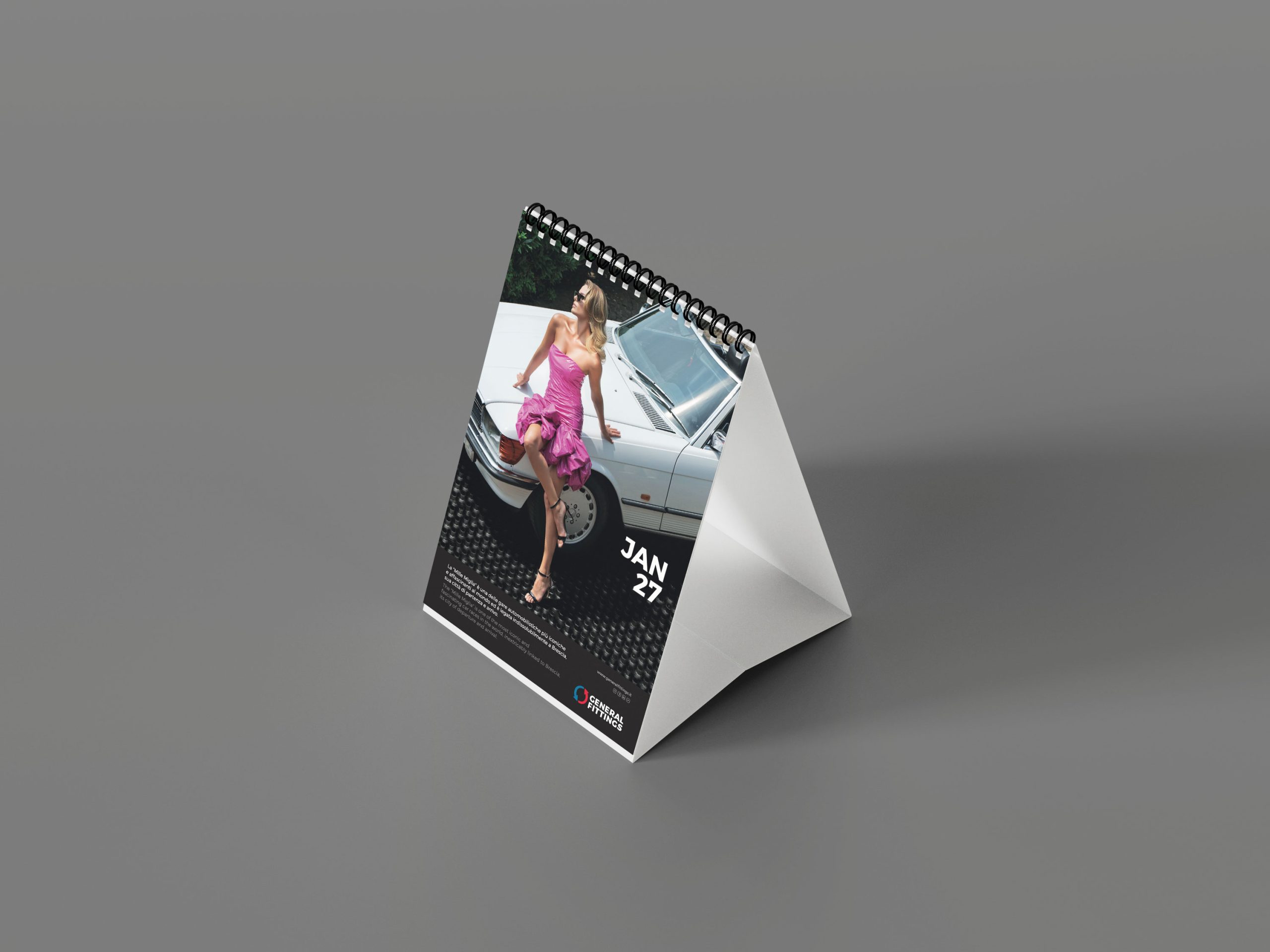
The brief was simple: to handle the art direction for a corporate calendar. But for General Fittings, we transformed the twelve months of 2026 into a visual journey along the shores of Lake Iseo, weaving together the precision of engineering with the charm of nature, and feminine boldness with the historical heritage of Franciacorta.
Reflections on the water
The brief had a clear direction from the outset: to anchor the corporate identity to its local area.
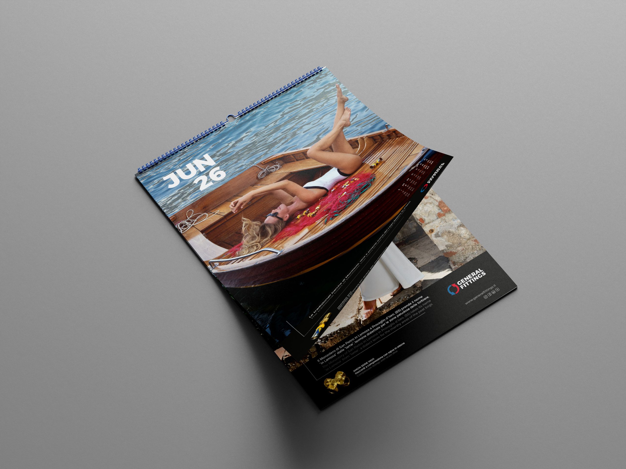
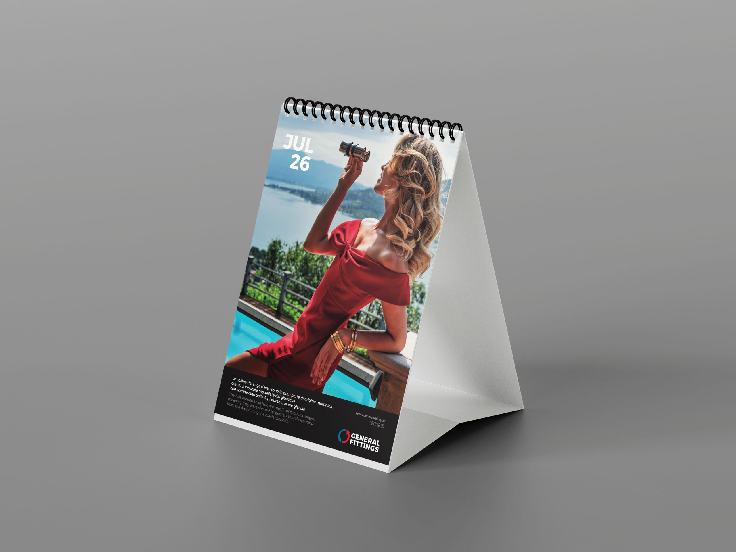
Our initial visual instinct immediately drew us outdoors, leaving the studio behind to embrace the open air of Lake Iseo. We rejected a mere display of geography in favour of striking a delicate balance between General Fittings’ industrial heritage and the unpredictability of the natural elements.
Combining the company’s manufacturing history with the memories of these places served as our main strategic compass, allowing us to avoid glossy, staged shots in favour of authenticity.
Unfiltered femininity
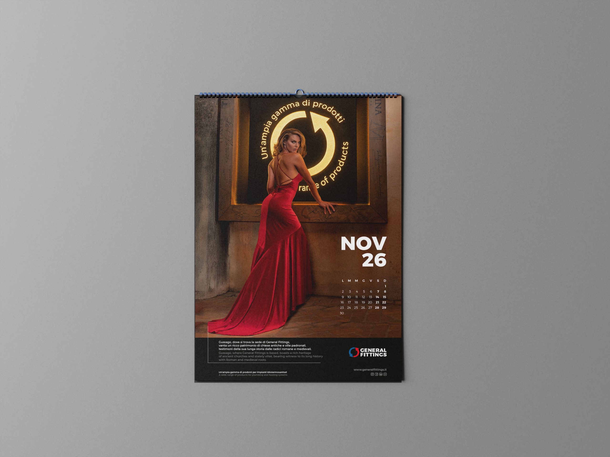
The project’s most compelling narrative tension lay in the marketing team’s clear intention to feature a central, charismatic and strong female figure.
The risk of resorting to visual shortcuts or trite aesthetic trends was ever-present: for this reason, we focused on celebrating boldness, doing away with any stereotypical portrayals.
Natural light
To give the calendar pages a distinctive character, we relied on natural light during a strictly itinerant photo shoot. The Franciacorta region dictated the pace and composition: the lake shores and surrounding hills defined the visual architecture of each shot.
The challenge resulted in shots capable of visually capturing the soul of the region, which were then transformed, during the printing stage, into slides with a strong tactile impact, highlighting the texture of the paper upon which the light and shadows would settle.
Shared roots
This printed project captures a relationship that has developed and matured over the years: that between Propaganda3 and General Fittings. A relationship which, over time, has driven our visual exploration in ever-new directions.
This time, the tangible result is a publication that restores General Fittings’ cultural significance to its home region, speaking the language of the eyes without the need for visual compromise.
To explore another visual project we have curated for General Fittings: Younique, Italian.