
Casa Sant’Orsola, what time is it? Aperitime!
Aperitime is the outcome of a clear, ambitious vision: creating a premium spirits line for mixology, capable of reinterpreting the Italian aperitivo ritual with a contemporary lens. The idea took shape within the historic Casa Sant’Orsola, a long-standing Piedmontese wine brand owned by Fratelli Martini Secondo Luigi SpA, and grew over 25 months of experimentation, research, and listening.
Aperitime by Casa Sant’Orsola is a project that unites product, storytelling, and relationships, where every detail—from design to tasting—was conceived to turn the Italian aperitivo into an experience to live and share.
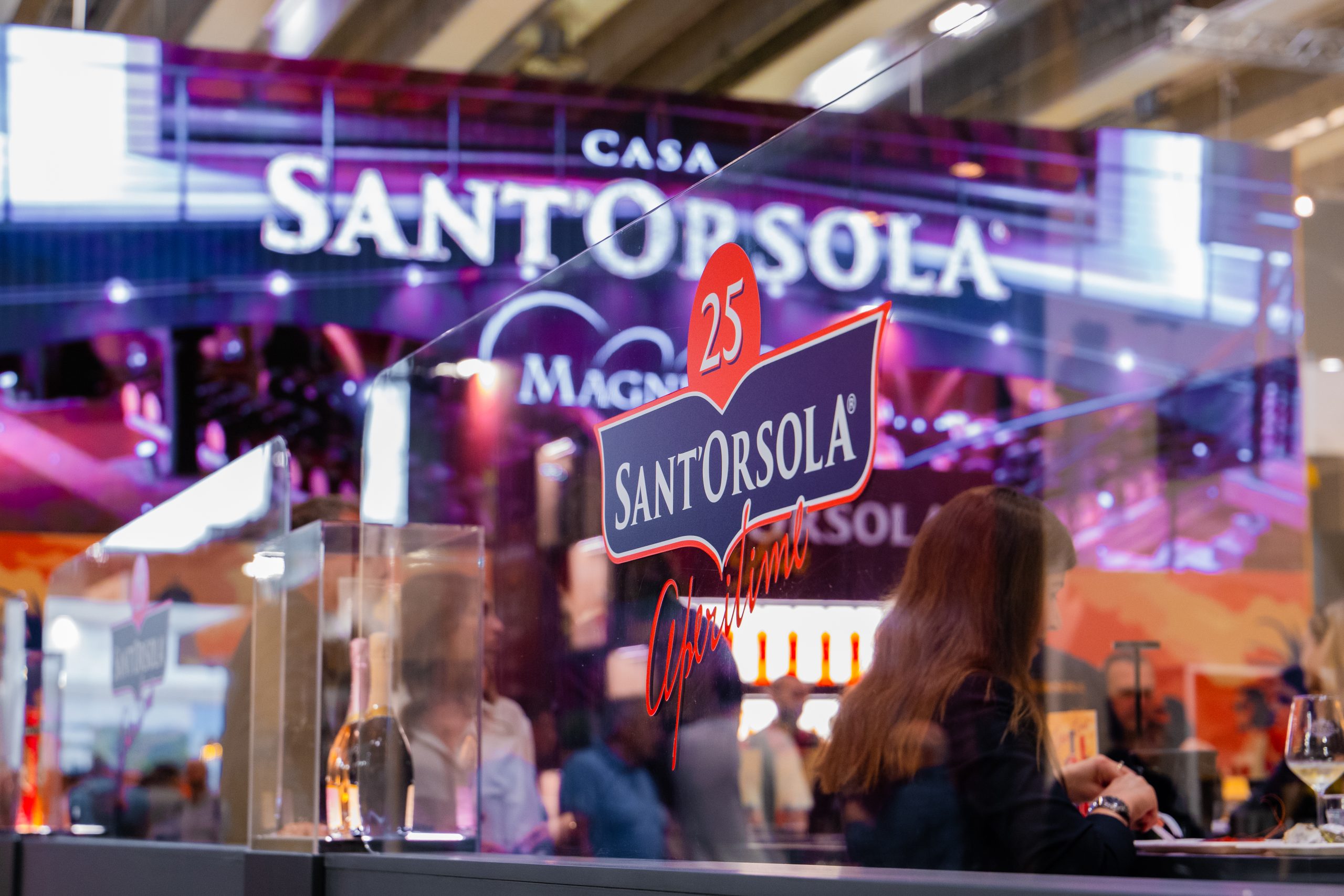
Vinitaly: the chance to step onto the world stage
Participation in Vinitaly Verona, one of the most important international wine fairs, enabled Aperitime to solidify its global positioning.
To achieve this, we created a stand that was elegant, immersive, and aligned with the Casa Sant’Orsola brand identity, and produced a 3D anamorphic video to capture the attention of trade visitors.
A tailored promotional campaign and a series of social media contents guided the audience toward Vinitaly, helping reach over 1,000 daily visitors to the Sant’Orsola Aperitime stand, for a total of more than 4,000, at the 2024 edition.
Concept: developing the idea
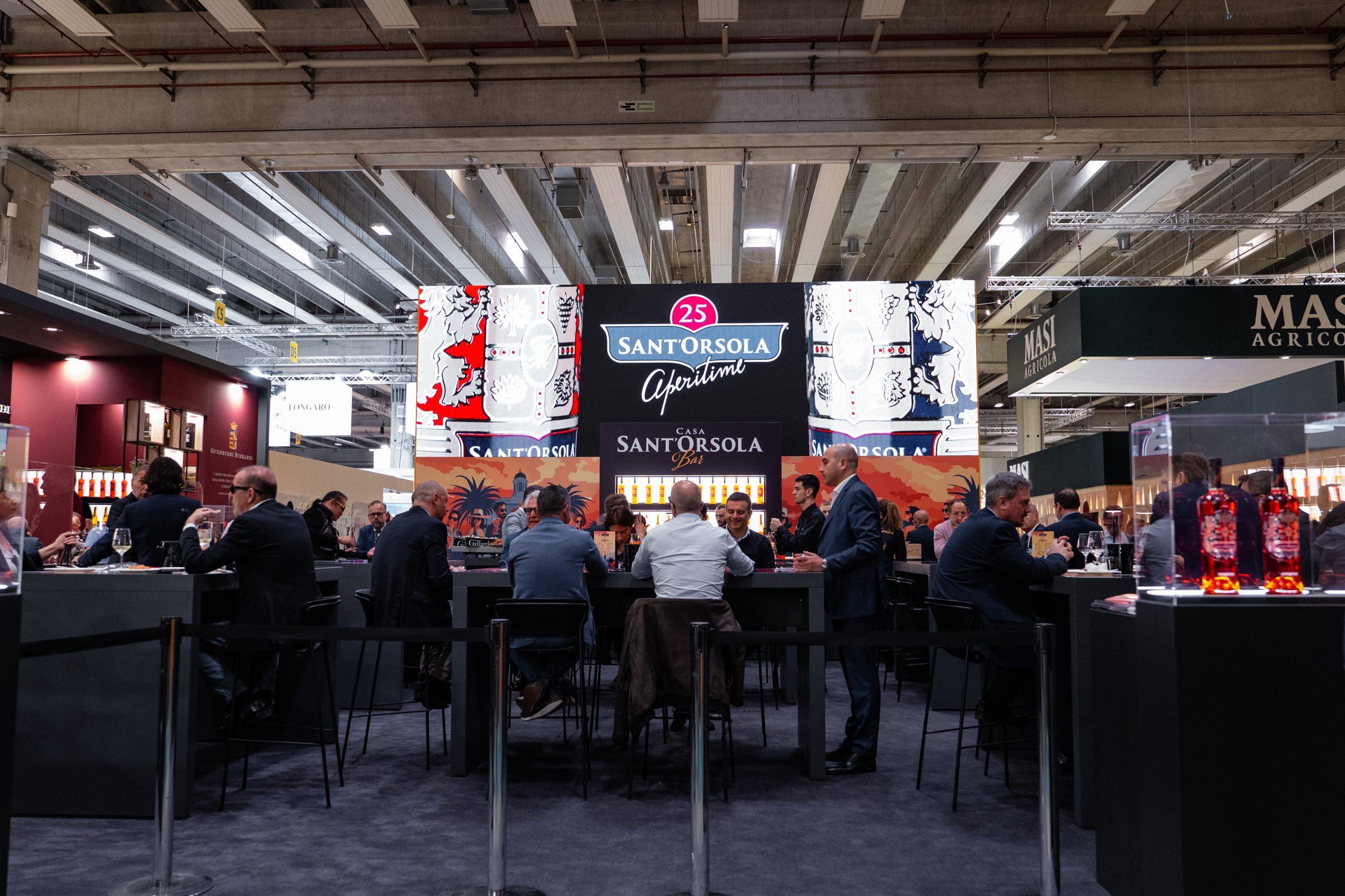
The number 25 is no accident. It symbolizes a meticulous journey of research that began with the intuition of President Gianni Martini, eager to create something unique—able to express the sunlit soul of Italy through the aromas and colors of aperitifs.
After 25 long months of trials, tastings, and refinements, the 25 Sant’Orsola Aperitime line was born—an entrepreneurial idea and a celebration of that long journey.
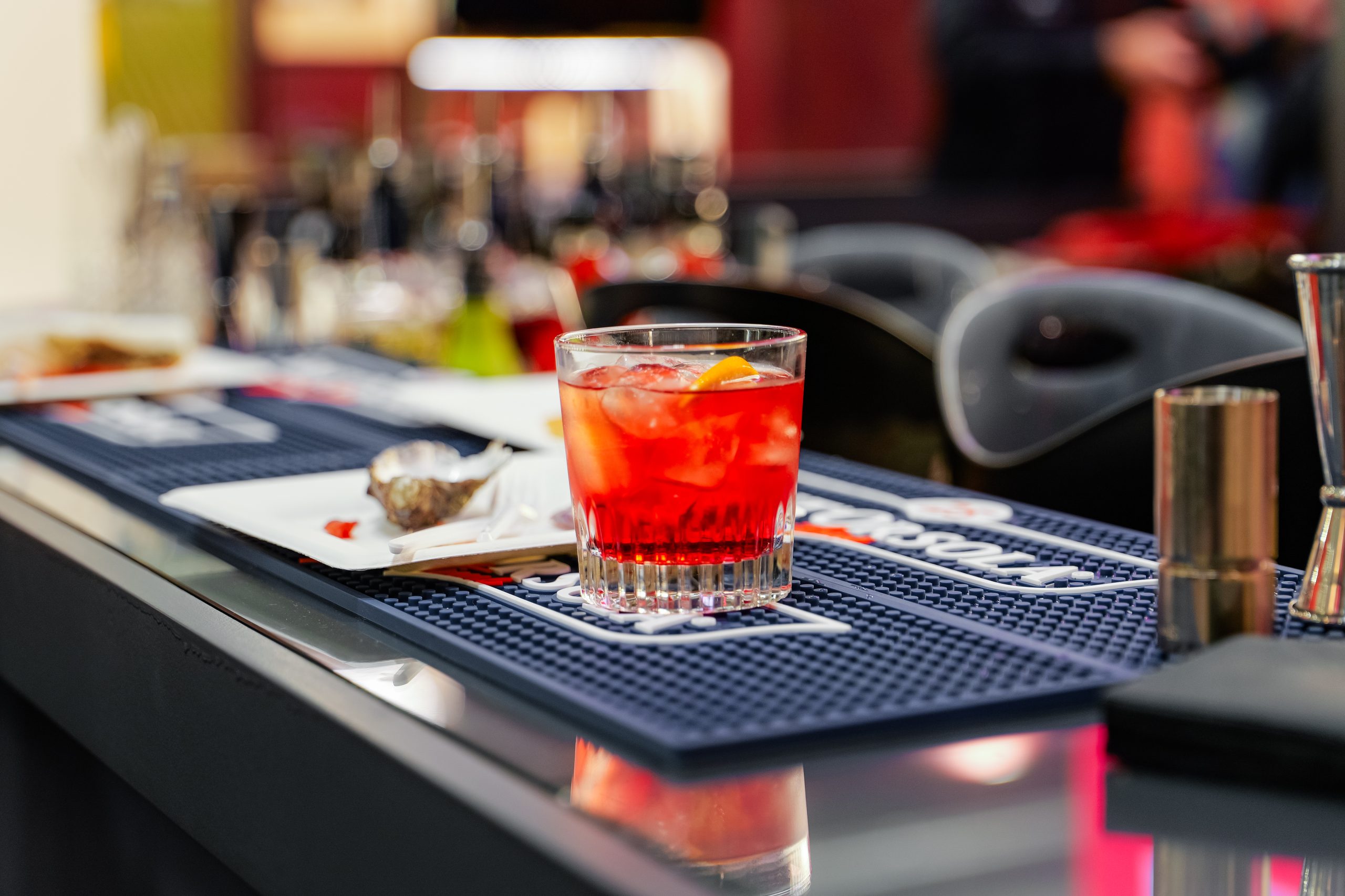
The Aperitime family by Sant’Orsola comprises 5 products, each designed to offer professionals and enthusiasts a versatile, rich, and refined base for classic cocktails and modern creations.
Branding: Aperitime’s logo and image
The logo blends modern lines with classic references, visually telling the story of a new generation of spirits. Warm colors, premium materials, and distinctive graphics help position the brand in the premium tier, across both HORECA and mass retail.
The brand identity of 25 Sant’Orsola Aperitime was developed to highlight the balance between Italian craftsmanship and visual innovation. The bottles, elegant and unmistakable, stand out for their heavy glass and golden details. On the communications side, illustrations take center stage, evoking characters, settings, and gestures typical of the aperitivo ritual.
In this way, Aperitime presents itself not just as a product, but as an experience to live and share.


Coordinated image: custom glassware, gadgets, tool kits
The brand’s strength extends through its coordinated image to all support materials, designed to ensure stage presence and recognizability in bars, venues, and events. A consistent design effort that speaks not only to the public, but also to mixology professionals behind the bar every day.
- Sant’Orsola Tool Kit: shaker, branded fridges, bar-top materials.
- Gadgets: aprons, bar mats, bottle openers, LED ice buckets, and limited-edition trays.
- Custom glassware: a line of custom glasses accompanies cocktails from bar to palate, with the Aperitime logo adapting to every context and spirit.
Brochures and flyers for mass retail and HORECA
For professionals active in HORECA and mass retail, printed materials such as brochures and flyers support agents in meetings with potential clients and distributors.